PlotViewer Description
The PlotViewer makes it easy for you to generate representative graphics from your data.
Such graphics are helpful for the quick generation for presentations, talks or
for meetings. Various commonly used graphics are supported:
– Scatterplots
– histograms
– boxplots
– Kernel density estimators
– Line plots
– and many more
Important parameters of the diagrams and graphics can be set interactively, so that
you can generate the optimal and most beautiful plot for your purpose.
Of course, the plots can be directly saved as an image
and they can thus be used immediately for your presentation.
Creating graphics with the PlotViewer saves time and provides high quality
results easier than ever.
PlotViewer Overview
PlotViewer Releases
PlotViewer Features
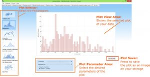
Switch to the Plot view by confirming the “Plot Viewer” button (see arrow).
![]()
In the diagram selection in the left side area (marked in orange) the diagram type can now be selected. It can be further adjusted in the settings area (marked in red). The “Save as Image” button (see blue arrow) opens a file dialog for saving the current diagram as an image file.
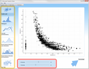
Scatterplot
The scatter plot relates two dimensions. In the settings area you can select the dimensions for the X and Y axis.
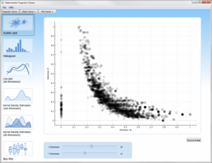
In this illustration of a scatter plot you have the possibility to configure two parameters. For the two controllers marked with dimension, select the respective column of their table for the X and Y axis, which is then to be displayed. For example, stage 1 corresponds for the first column, stage 2 for the second column, and so on.
Histogram
A histogram shows the distribution of values within a dimension. Each value is assigned to a class that covers a certain range of values. The settings area offers the possibility to choose the dimension and the number of classes (“bins”). In addition, the scale of the Y-axis can be adjusted: “Absolute” number of data points in a class, “Relative” number of data points in a class divided by the total number of all data points
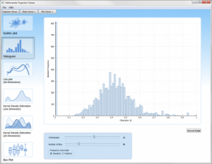
In this histogram illustration you can configure three parameters.
First:
For the controller, which is designated by dimension, select the respective column of the table, which is to be plotted in the histogram. For example, stage 1 corresponds to its first column, stage 2 its second column, and so on.
Second:
You can adjust the fineness of the display using the “Number of classes” slider. The larger the value, the more accurate the representation.
Third:
The function values on their Y axis can be represented as absolute number or percentage. Depending on that, they can control this via the “Absolute” and “Relative” options.
Line Plot
The Line Plot displays every data point of all dimensions as a poly line. Therefore it particularly suitable for smaller data sets. Each dimension is assigned a colored line describing the values for that dimension in the order of the record.
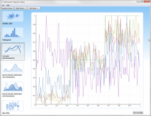
Here, in the line plot, all information of the respective columns of the current dataset are displayed simultaneously.
Kernel Density Estimation (one dimension)
Kernel Density Estimation (KDE) describes the distribution of values within a dimension and is thus comparable to the histogram. Instead of classifying the values, a normal distribution is used here to represent the density of the values. In the settings area you can select the dimension as well as the bandwidth (sigma) of the underlying normal distributions.
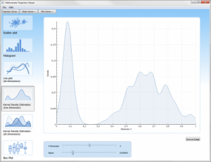
This illustration can be used to represent a core density estimation for each column. To do this, select the controller labeled Dimension to display the respective column of the dataset. With the next setting, you can adjust the resolution of the blur.
Kernel Density Estimation (all dimensions)
This chart type displays the KDE for all dimensions. In the settings area lets you choose the bandwidth (sigma).
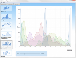
In this illustration, they receive a simultaneous display of all core density estimates for each existing column in the dataset. With this setting you can adjust the resolution of the blur.
Box Plot
This chart type shows the five-point summary (median, the two quartiles and the two maxima) for all dimensions/columns. Each dimension is represented by a box with two antennas. The antennas show the maxima (highest and lowest value). The bottom and top edges of the box show the quartiles (.25 and .75 quantiles) and the horizontal line through the box indicates the median.
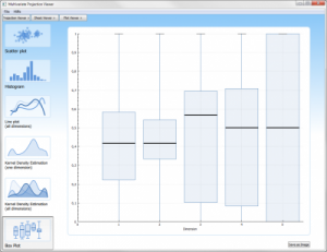
From this boxplot-graphic, you can get a quick impression, in which areas their data lie and how they distribute themselves over the area.
Using the so-called five-point summary, the median, the two quartiles and the two extreme values, each column from the dataset is displayed here.