ProjectionViewer Description
Our ProjectionViewer enables a visual inspection of your data using multivariate projections. Thus, the data set is completely visualized at once and thus relations in between several dimensions or columns of your data are involved at once, too. Clearly, you can easily find global relations of your data with the aid of multivariate projections.
Amongst others, this module offers a broad set of analysis functions:
– Manual Inspection
– Optimal Set of good Projections
– Star Coordinates
– Radial Visualization
– Othographic Star Coordinates
– General Projective Maps
– Visual Clustering
Our manual inspection enables to interactively search for interesting projections. Why? Because there are so many projections available in general, so that our manual inspection will help you to quickly find the interesting onces amongst them.
We have further related tools for you: You can precalculate a set of good projections that shows interesting structures of your data. For this, you can use our function named “Optimized sets of good projections”. Of course, we also offer PCA and MDS-eske configurations, and much more.
We also offer different projection types, such as Star Coordinates, Radial Visualization, and Orthographic Star Coordinates.
In general, you also have access to our “General Projective Maps”, which allows the subject matter experts amongst you to explore the complete space of linear and non-linear multivariate projections.
In addition, we offer interesting visual lens concepts, such as our Polyfocal Magic Lens and our Projective Magic Lens, in order to interactively disclose further interesting properties of your data.
Moreover, we have sophisticated tools to conduct a visual clustering of your data and much more.
Overall, our ProjectionViewer is a powerful tool for the visual data analysis.
ProjectionViewer Overview
ProjectionViewer Releases
ProjectionViewer Features
- Star Coordinates
If you press here, you get so-called Star Coordinates. That means that the triangular projective coefficients are placed on the center. For the subject matter experts amongst you let us tell you: It means that the projective coefficients are set to the value of 0 and we get a linear multivariate projection.
- Orthographic Star Coordinates
If you select the item “orthography-preserving” and you conduct a manual exploration, you will notice that the other axes adopt themselves independently.
Clearly, the axis seem to be coupled with each other now, and indeed they are. We call such projections “Orthographic Star Coordinates”. Their purpose is to prevent that the distance information of the data changes too much within the projection.
What does that mean? Imagine a sunset and a little garden gnome: The shadow of the garden gnome seems to be huge, although the garden gnome itself is rather small. In this metaphor, the length of the garden gnome corresponds to the distance properties of your data, while its shadow corresponds to its mapped distance property, seen in the projection.
Now, look again back to the shadow of the garden gnome. You would think that you are dealing with a very large garden gnome. Of course, this is still not the case, but this impression is just caused by the sunset! Unfortunately, such distortion effects often occur in projections. The trick to minimize such distortions is to choose the sun’s position in a way
that the shadow of the garden gnome is as large as the garden gnome itself.
In our metaphor with the garden gnome, the position of the sun corresponds to the configuration of the axes of our axis arrangement. Thus, the Orthographic Star Coordinates choose the axes configuration automatically in a way so that such distortions are minimized, which means that the shadow length of the data in the projection is similar to the length of the original data to each other. Now we have such unfavorable distortions in the projection successfully reduced.
- Radial Visualizations
If you press here, you get a so-called Radial Visualizations. That means that the triangular projective coefficients are placed on the main ring. For the subject matter experts amongst you let us tell you: It means that the projective coefficients are set to the value of 1 and we get a non-linear multivariate projection.
- Radial Layout
If you press here, then the axes are arranged radially and conformal, respectively. Clearly, we place the anchor points on a circle, to enable a better overview for you.
- Manual Inspection
Our ProjectionViewer enables a visual inspection of your data using multivariate projections. Thus, the data set is completely visualized at once and thus relations in between several dimensions or columns of your data are involved at once, too. Clearly, you can easily find global relations of your data in multivariate projections.
Another property of such multivariate projections is that there are an infinite number of them. So, how can we find interesting projections at all? In order to explore the space of projections for interesting projections, our module offers the possibility of a so-called manual inspection:
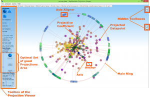
What does it mean? Well, first of all, you see a variety of star-shaped lines, which we call axes, centered in a common centerpoint. At their upper end, you see control points, which we call anchor points. You now need to know that aligning the axes and placing the anchor points, respectively determines the projection properties of how the data are projected.
The longer or shorter an axis is, or even if you would change their angle, the more different the resulting projection would look like. Having said this, it also becomes clear now that there are really an infinite number of such projection configurations available.
However, you can independently place the anchor points interactively in the screen space and thus you can determine by yourself the properties of your projection. We call this process a manual exploration. It allows you to find interesting projections of your data. To do this, just move the anchor points around to the desired location by using Drag & Drop.
By the way, in order to solely change the angle of your axes and anchor points, respectively, but without changing their length, you can interactively use the box-shaped items, which are placed on the main ring. We call them axis aligner.
We think the axis aligners are another comfortable tool, which hopefully makes the manual exploration even easier for you.
- Optimal Set of good Projections
With the aid of our ProjectionViewer, you can precalculate a set of relevant projections, which shows interesting structures of your data. For this, we use the concept of optimized sets of good projections. The idea is, that you do not have to manually select the individual axes until you find an interesting structure, but to precalculate interesting axis configurations in advance.
To calculate such interesting projections, press this button to start the calculation process. By the way, you only need to calculate this once per dataset. We automatically save your results for future sessions. This one-time calculation itself might take a few seconds or minutes, depending on the size of your data. The parameters at this point, which control the calculation process, are already optimally chosen, and can be directly used.
Once the calculation is complete, you will see a new slider and another select box. It enables you to view through the individual precalculated projections one by one. You can either view each projection individually by selecting the “Step” option, or they can be presented as an animated tour by selecting the “linear interpolated” option. If you use the slider now, you will see – depending on the selection – the individual optimal good projections or an animation of them.
Here is another tiny hint for the subject matter experts amongst you: Of course, you also may have relevant projections by using a principal component analysis. To do so, simply click on the “PCA available” button and mark the checkbox beside. Now you can explore the PCA-based projections with the slider. Between the optimal projections and the PCA-based once, you can switch over by using the checkbox.
The advantage of our optimized projections in comparison to the PCA-based is that the optimizer comes out with a number of n-half many projections, while there are n-square many projections required in the PCA-case, and you also require Gausian-distributed data for PCA. Here, n is the number of dimensions or columns of the data set. Please note, all of such sets show the projection space completely.
- General Projective Maps
Multivariate projections have very powerful but often astonishing properties. For instance, check out our video of our Orthographic Star Coordinates: There, you already have been given an idea about the fact that distance properties of the data can change in the projection. We name this a distortion.
Another astonishing property is that there are so-called linear and non-linear projections. The difference is that the strength of the distortion for certain data may depend on the location of them within the data space. Certainly, a very abstract concept!
However, if this effect applies, we call them non-linear projections,
otherwise they are named linear projections.
If you want, you can blend between non-linear and linear projections with the aid of our tool.
How does it work? As you may already noticed, you see small interactive triangles along the axes. Right? We call them projective coefficients. If these are placed at the center, all coefficients have the value 0, and we get linear projections. If these are placed on the main ring instead, all coefficients have the value 1, and we get non-linear projections.
If they are placed somewhere in between, they have a value between 0 and 1, or even more when you go towards. The bigger their value, the more non-linear the projection becomes. Therefore, you can freely control this property with the interactive triangles on the axes. We call this concept “general projective maps”.
By the way, if these triangles are placed in the center, we get the Star Coordinates, if they are placed on the main ring, we get Radial Visualization. So, this might be a good time to also check out these videos, right now. Enjoy!
- Projective Min Distance Error
If you select the item “projective min distance error” and you conduct a manual exploration, you will notice that the triangual projective coefficents adapt themselves independently.
Clearly, the projective coefficents seem to be coupled with each other now. And indeed, they are. Their purpose is to prevent that the distance information of the data changes too much within the projection.
The concept is similar to our concept of the “Orthographic Star Coordinates”. So, you may also check out our video for the “Orthographic Star Coordinates”.
However, in the concept of our “projective minimal distance error” the axis configuration remain untouched. Instead, the projective coefficents are choosen optimally in a way that distortions are minimized, which means that then the distances of the data within the projection is similar to the distance of the original data to each other.
- Projective Magic Lens
If you select here the item “Projective Magic Lens”, you can let appear a visual lens when you press the right mouse button anywhere in the screen space.
The radius of this lens can be steered be scrolling the wheel, while keeping the right mouse button pressed. The strength on how strong the impact of the lens is can be controlled with this slider here.
The idea of this lens is to minimize distortions of your visualized data, but without the need of adapting the axes configuration in any way. Instead, the lens automatically selects the triangularly visualized projective coefficients in an appropriate manner.
If you are still not fully aware of the meaning of our projective coefficients, then you instantly may check out our information video to the “general projective maps”. Enjoy!
- Polyfocal Magic Lens
If you select here the item “Polyfocal Magic Lens”, you can let appear a visual lens, when you press the right mouse button anywhere in the screen space.
The radius of this lens can be steered be scrolling the wheel, while keeping the right mouse button pressed. The strength on how strong the impact of the lens is can be controlled with this slider here.
The task of this lens is to enable a magnifying effect to your projection on demand.
- Projectivity Parameter
The projectivity coefficient arrows can be turned on or off.
- 1-Ring Axis Visible
Here you can hide or show the axis aligners.
- 1-Ring Visible
The main ring can here switched on or off.
- Anchor Visible
All axes can here switched on or off.
- Fix Axis Zooming
If you set the checkmark here, you can scale the data by scrolling with the mouse wheel. The parameters remain fixed.
- Perimeter Visible
If you set or remove the checkmark here, you can show or hide the perimeter axes.
- Axis Width
With this slider, you can adjusted the width of the axes.
- Axis Transparency
With this slider, you can adjusted the transparency of the axes.
- Anchor Size
The anchor size of all dataset dimensions can set here.
- Icon Size
The size of all dataset entries can also be set here.
- Icon Transparency
The transparency of all dataset entries can be set here.
- Change Icon
The display symbol of all record entries can be changed between different forms.